


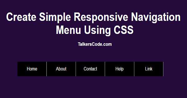
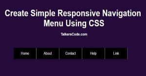
Create Simple Responsive Navigation Menu Using CSS
Last Updated : Jul 1, 2023
In this tutorial we will show you how to create a simple responsive navigation menu using css so that your menu is always looks good no matter what the device is. You may also like floating navigation menu using HTML and CSS.
CHECK OUT THIS TUTORIAL LIVE DEMO →
To Create Responsive Navigation Menu It Takes Only Two Steps:-
- Make a HTML file and define markup and scripting
- Make a CSS file and define styling
Step 1. Make a HTML file and define markup and scripting
We make a HTML file and save it with a name menu.html
<html>
<head>
<link rel="stylesheet" type="text/css" href="menu.css">
<meta name="viewport" content="width=device-width,initial-scale=1.0" />
<script type="text/javascript" src="jquery.js"></script>
<script type="text/javascript">
 function toggle_menu()
 {
  $("#menu_link").slideToggle();
 }
</script>
</head>
<body>
<div id="wrapper">
 <div id="navigation_menu">
  <img src="images/menuicon.png" onclick="toggle_menu();">
  <div id="menu_link">
   <li><a href="#">Home</a></li>
   <li><a href="#">About</a></li>
   <li><a href="#">Contact</a></li>
   <li><a href="#">Help</a></li>
   <li><a href="#">Link</a></li>
  </div>
 </div>
</div>
</body>
</html>
In this step we create a div for navigation menu and add menu icon and some sample links
and create a function toggle_menu() which is used to show hide the menu in small screen and use meta tag 'viewport' to make our webpage responsive.
You may also like slide in navigation menu using jQuery and CSS.
Step 2. Make a CSS file and define styling
We make a CSS file and save it with a name menu.css
body
{
 width:100%;
 margin:0 auto;
 padding:0px;
 font-family:helvetica;
 background-color:#0B614B;
}
#wrapper
{
 text-align:center;
 margin:0 auto;
 padding:0px;
 width:995px;
}
#wrapper h1
{
 color:white;
 margin-top:100px;
 font-size:40px;
}
#wrapper h1 p
{
 font-size:17px;
}
#navigation_menu
{
 background-color:black;
 margin-top:200px;
 width:600px;
 height:50px;
 margin-left:180px;
}
#navigation_menu img
{
 float:left;
 margin-left:5px;
 margin-top:10px;
 cursor:pointer;
 display:none;
}
#navigation_menu #menu_link
{
 clear:both;
}
#navigation_menu li
{
 float:left;
 list-style-type:none;
 width:119px;
 height:50px;
 line-height:50px;
 border-right:1px solid silver;
}
#navigation_menu li a
{
 color:white;
 text-decoration:none;
 display:block;
}
@media screen and (min-width: 961px)
{
 #navigation_menu #menu_link
 {
  display: block !important;
 }
}
@media only screen and (max-width: 960px)
{
 #navigation_menu
 {
  position:relative;
 }
 #navigation_menu img
 {
  display:block;
 }
 #navigation_menu #menu_link
 {
  display:none;
  position:absolute;
  top:50px;
  background-color:grey;
 }
 #navigation_menu li
 {
  clear:both;
  float:none;
  border:none;
  border-bottom:1px solid silver;
  text-align:left;
 }
 #navigation_menu li a
 {
  text-align:left;
  padding-left:10px;
 }
}
In this step we use @media screen to apply different styling for different screen size to make our webpage responsive.
'@media screen and (min-width: 961px)' is used to display navigation menu when screen
width is greater or equal to 961 and we use '@media only screen and (max-width: 960px)' to show different styling when the screen width is less than or equal to 960px.
You may also like CSS animated navigation menu.
Thats all, this is how to create responsive navigation menu using CSS and HTML. You can customize this code further as per your requirement. And please feel free to give comments on this tutorial.
I hope this tutorial on responsive navigation menu helps you and the steps and method mentioned above are easy to follow and implement.
 About Amruta
Amruta is an Experienced web developer with 4 years for experience she completed her master's with MCA and passionate about programming Languages for creating technical contents like HTML, CSS, JavaScript, Java, Python, PHP, jQuery.
RELATED TUTORIALS
 Create Simple Responsive Navigation Menu Using CSS
 Create Floating Navigation Menu Using HTML And CSS
 Animated Navigation Menu Using CSS And HTML
 Slide In and Slide Out Navigation Menu Using jQuery And CSS
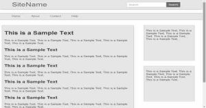 Simple And Best Responsive Web Design Using CSS
- Simple And Best Responsive Web Design Using CSS Part 2
 Simple And Best DropDown Menu With Pure CSS And HTML
 Cool And Simple Vertical Accordian Menu Using jQuery CSS and HTML
 Create Responsive Contact Form Using HTML And CSS
 Create A Full Responsive Table Using HTML And CSS